Wednesday, 19 September 2012

F A B R I C A T E 

Week Five Summary:

Tutorial Two:

Today was our first tutorial after the hand in and presentations for the first project. We were introduced to project two an went through the brief outline the important dates and hand in. For our second project we are to produce a model solely using the lazer cutter to create a form which represents our final model from our last project. 

Im looking forward to this project as it will be interesting making our model which were in a 2D form and bringing them to life as a 3D form which we create ourselves. 

Some examples of laser cut models I found on the internet:

 This design uses the stack method, cant see how the model is held together but it looks aesthetically pleasing, it is different turning multiple piece  of acrylic into a 3D model
 I like the aesthetics of this model as it is very integrated and complex, major consideration would have been put into how the pieces were put together using the slot method. The male and female slots must all be sized up accordingly perfectly so the pieces fit and stay in due to friction.
To create an effect like this with laser cut acrylic requires work after the pieces have been printed as you cant curve the straight piece which is cut out of the laser printer. The pattern and design is cool but would be a hard model to produce.


Next tutorial Earl is to take us through the section method which could very well be used to create me model to display my form/structure from project one. 

Tuesday, 18 September 2012

I N T E R A C T I V E  M O U S E  T O Y 

My Idea:

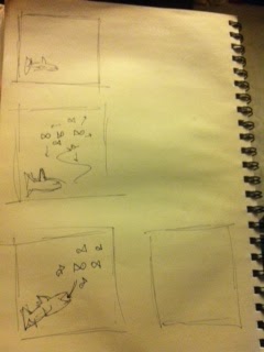
When I think of interaction I think about something that is fun which attracts your attention and keeps you entertained whilst teaching you the interaction as well as looking visually pleasing. Initially my first thoughts were to create an interaction with the form which you perceive as being a live, something with a mind of their own which we can not only be control by you but also act as if it is living their own lives when you are not specifically interacting with the interaction. With my idea I wanted to create fish forms which lived and acted like fish do, the same movement characteristics as real fish to give that effective aesthetic and to create an interaction I wanted to have a shark figure which caused the fish to move in different directions and avoid contact with the shark as it represents a key predator for fish. When the mouse is clicked the fish are able to be eaten by the shark, once the shark is full and has enlarged in size you release the mouse and the fish all exit in a vortex manor. After that the interaction restarts and creates a loop for interaction. 

This week I shall create a photoshoped story board to better express my ideas. 

Monday, 17 September 2012

I N T E R A C T I V E  M O U S E  T O Y 

Week Seven Summary:

Tutorial Two:

Today we again discussed mouse interactions and started to think about our own interactions which we will be producing. Ben instructed us to start making story boards to think about our interactions then choose one and specifically think about what each mouse movement does.

Here are my story boards which I quickly made before class:

With this interaction you throw the ball with the mouse which causes the smaller balls to bounce around until they become static. 

Answering Questions:

1.) Takes the user 5 seconds to learn the interactions
2.) they are learning that throwing the ball causes the smaller balls to react and go every where
3.) It is still interesting as you dont know where the balls go


With this interaction you have a alpha object which there are millions of tiny objects which in a sense run away from the mouse object you move creating a nice visualization.

1.) User is learning about how the smaller objects move away when the mouse is moved around them

2.) they learn in 2 seconds

3.) it is still interesting after you learn the interaction as its like they have a mind of their own.


With this interaction it is more like a game where you have to "swat" the balls.

1.) user learns to swat the ball
2.) learn the interaction in 2 seconds
3.) it is still interesting as it requires you to hit the ball.


After that ben told us to go through and choose one and look at each mouse movement in more depth,

Here is my chosen interaction, the alpha object moves around as the smaller ones move away as if it is living and has its own mind.

If you click the mouse the objects start to head to the Alpha object in a vertex form.

As you release the right click they all spread out from the alpha  object.


From this I will start to create my interaction on processing
I N T E R A C T I V E  M O U S E  T O Y

Week Seven Summary:

Tutorial One:

Today we were introduced to our third project for the course and went over the brief. Our new project is about making a interaction which is controlled by our mouse, different actions cause different reactions and interactions. Ben showed us examples of past work and also explained in depth about interactions themselves, talking about how how the mouse can control a stationary object but it is an interaction when the reaction is unknown and surprises the user! Ben also told us to consider these three questions every time we consider our work,

1.) What is the user learning?
2.) How long does it take the user to learn the interaction?
3.) Once the user has learnt the interaction is it still interesting?

After we all talked we went through the processing website to find inspiration and look at examples of interactions to help us to think about our own projects.

These are the interactions I found interesting:

http://www.openprocessing.org/sketch/63636


This code is actually written by a first year design student who took coding in the first trimester. I found it very interesting and exciting to use.

answering the questions:

1.) Learning that moving the mouse moves locations of the crystals
2.) It takes about 10 seconds to learn every different interaction
3.) It is still interesting after I have learnt the interaction as the crystals move in their own way and fee  like they have their own brains and they're alive

http://www.openprocessing.org/sketch/8062


I love this interaction as it is so interesting and visually creates a aesthetically pleasant visual display on your screen>

answers to questions:

1.) learn that clicking the right click causes a vertex to go to the center and when let go it spreads everywhere
2.) It took me around 5 seconds to learn the interaction
3.) The interaction is still interesting as you can move the mouse around and create an unreal effect.

http://www.openprocessing.org/sketch/157


This code dosnt have much of a mouse interaction but I just enjoyed the visual aspects of the design.

Answers to questions:

1.) Learnt that clicking the mouse made the cicles form faster
2.) Took me seconds to learn the interaction
3.) The interactions is interesting to watch as it feels as if it has its own brain and does what it feels.


Overall the research was effective as I have now seen examples which help me to start generating ideas in my head about what my next step is.

Sunday, 16 September 2012

N A V I G A T I O N  I N T E R F A C E 

Week Seven Summary:

Tutorial Two:

Today we discussed ideas and concepts so far that people have developed so far for this project. We talked about the interim which is next week and what we need to bring and hand in. For next week we need a wireframe and up to date blog posts up to date. We made a timeline for every tutorial and how this trimester will pan out.

I have been thinking about my idea in depth and at the moment I am thinking I want it to be quite simple to I am sticking to the iphone app idea to show my interface. I want my map to be real time using internet and gps which shows  your location where you are in real time aspects, the screen will be split into two maps, a satellite real time on the top half and a street view real time on the bottom to see the view from your perspective. I also want my app to have a student data base where every students class room table is uploaded so they can easily pick the class that they actually have a class in and then it saves it to a folder called "Log" where it logs all of your travels so far.


I found this video clip on your tube and found it very interesting and feel that I could apply this to my concept to provide a holographic arrow which is also real time to show which direction to travel as well as other widgets such as a a compass etc.

For next week Im going to start producing my wire frame to get ready for the interim on Friday.
N A V I G A T I O N  I N T E R F A C E

Week Seven Summary:

Tutorial One:

Today was our first tutorial back from mid-trimester break. We all discussed what we had research and found out in the holidays as well s interfaces which we found interesting and effective for this project. I think the most effective component of this project will be the visual aspects to how the navigation interface is displayed to the user. I think that interfaces using smell and hearing sense will fail dramatically as they will not be sufficient and there are to many aspects that can cause them to fail, such as for the hearing sense noise pollution will make it very difficult to hear what your interface is trying to communicate. On that note I have decided that mine will be based on a visual aspect and from the research I did in the holidays I think that a street view combined with a satellite view will be best to express my interface to get one being from A to a room in the Kelburn campus. It will be easier to use perspective to visual where you are according to surroundings.

After our discusion we were instructed by Zane to head up to Kelbrun to locate different locations to learn the experience and start to think about how our user will be feeling during this experience and how we got around the campus to find the certain buildings and rooms.

We were to locate and find:
1. Hunter 015
2. Murphy 406 (or 404)
3. Criminology Department
4. The School of Music, and find a grand piano.
5. A creche.


We started by leaving the Te Aro campus from the front main entrance and straight up Vivian street, numerous crossings on the way up and I noticed there was a lot of road and foot path traffic, as the streets are wide with lots of recognizable buildings and structures the street view will be very effective to display the path to follow. We headed up towards the Te Puni halls of residence building which over looks the harbor after a long steep hill climb towards the campus. We then spilt up in to groups to venture for the rooms on our owns. As some of the guys I was grouped with knew a few rooms they could easily guide us, we all knew where the Murphy building was located so we all headed there firsts. 

We found these little maps all over the campus which were quite helpful and easy to follow. 

As well as campus maps all over the campus we also found maps on each floor and level displaying each room and how to get there including where you are, simple floor plan maps. 

Once we had found the maps it was easy to work out where the next buildings and rooms were, hunter 015 was a little difficult to find but after working out what the numbers in the code meant (015=ground level) we could go there without getting to lost. 


- Image from the criminology floor


- Image from The School of Music


In conclusion once we had found the maps it was to hard to navigate ourselves around the campus, although it would have been easier if we were given exact directions, which is where our app comes in to play. The rooms were easily found and it was a success.

Going through with this exercise was effective as now we know how it feels to be lost and have no directions and image how our app will help to navigate us around the campus as intended. 

Wednesday, 12 September 2012

N A V I G A T I O N  I N T E R F A C E

Research:

Over the break I did some research on different map interfaces and what makes them effective and what the negatives and positives are of using that certain interface.

T R A N S P O R T  M A P
This map is primarily used by transport provides such as metlink and GO bus services to expressively show different routes which they provide transportation too. They will generally have a start point which is primarily a depot with a finish point where the route ends. The map detains itself is very brief so it does not give much information out the mapping or surrounds, therefore this type of mapping will not be sufficient for our project as detain is insufficient and wont give enough information for new people to get from anywhere to a room in Kelburn.

C I T Y  M A P
Much like the transport the city map lacks detail and only express mainstream streets where there are attractions and tourist like features. City map is zoomed into one part of the city and only expresses that. Color coding helps with expressing the key although I don't think this type of mapping will be effective as it lacks detail an only focus on one aspect of the landscape.


S T R E E T  V I E W
Street view is a new way to view maps as it gives an effective direction as it is in the perspective of the viewer, therefore it shows more defined and definitive direction as the viewer can compare his/her perspective to the one shown on the digital device expressing the street view. This could be an effective interface for this project as street views are accessible and effective.

T O P O G R A P H I C A L  M A P
Topographical maps are generally used to gather geographic information as it displays detains such as density, hills and land area. This map interface will not be effective for me as it expresses no street detail only geographic.

P E R S P E C T I V E  M A P
Perspective maps are effective although only from the perspective you see it in, as detail can be lost due to other building in the way. For some this view can be hard to follow if they are not familiar with the surroundings. This could be an option for my interface although I think simplicity is key

S A T E L L I T E  M A P
Imagery taken from millions of kilometers away effectively display everything in birds eye view, effective as it expresses everything in real form and not fake drawn up. Once zoomed in it can be easy to follow by streets. The S A T E L L I T E  M A P  W I T H  S T R E E T S is most effective as it displays street names and relevant information about the surroundings of your location as you view it which makes it easy to follow, especially on interfaces such as the Maps iPhone app which also displays your current location on real time so its even easier to follow. This type of mapping could be effective for this project as it easily to follow, especially when it provide real time location services.

F L O O R  P L A N  M A P
I think this interface of mapping is ineffective with this project as it will get very complicated trying to follow a full floor map of wellington city, would be very hectic!


From my research I have concluded that the three most effective maping interfaces which will be most appropriate for this project are:

S T R E E T  V I E W:

I think the street view is effective as the viewer can view in real time where they are traveling and the path which they must follow to get to their destination. This could work well for my project if I can figure out an effective was to express it such as contact lenses or something creative like that.

S A T E L L I T E  M A P:


I find this interface effective and can see it working for my project as its easy to follow, only downside is that it isn't as aesthetically pleasing to view as a third mapping system.


From this research I hope to gain a good perspective on mapping and start to think about how I am going to express my mapping interface in my project.
N A V I G A T I O N  I N T E R F A C E 

Week Six Summary:

Tutorial two:

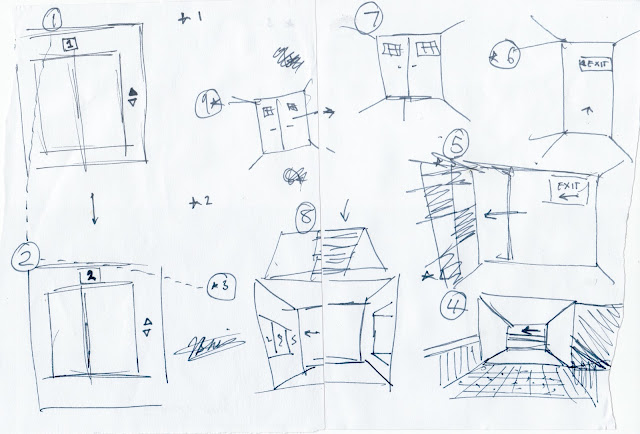
Today we were briefly introduced to our second and last project for this course. Our tutors also switched and our new tutor is Zane. As an exercise to get us thinking about mapping styles and interfaces our tutorial group was split into groups of 4 then split again into 2s. We were then all given a different type of expressing a path on a map such as pictures, plain instructions, symbols and traditional mapping to any room in the campus. This was effective as it helped us to open our perspectives and get us thinking. My friend and I got drawing pictures from the viewers perspective as our exercise to express where we wanted our viewers to proceed too.


This is what we came up with, it was a little scattered over the page and a little hard to see which went where but the people who tried this all could follow our instructions and find the room we had chosen a our finish. 

Effective first exercise to get us all thinking, over the break I shall investigate and research all the different types of map interfaces. 

Thursday, 23 August 2012

S T R U C T U R E  &  N O I S E 

Final Board 


Individual Boards:


I think I have created an effective series which express structure and noise exploring loops, color gradient and variables.

Tuesday, 21 August 2012

S T R U C T U R E  &  N O I S E

Week Three Summary:

Tutorial One:

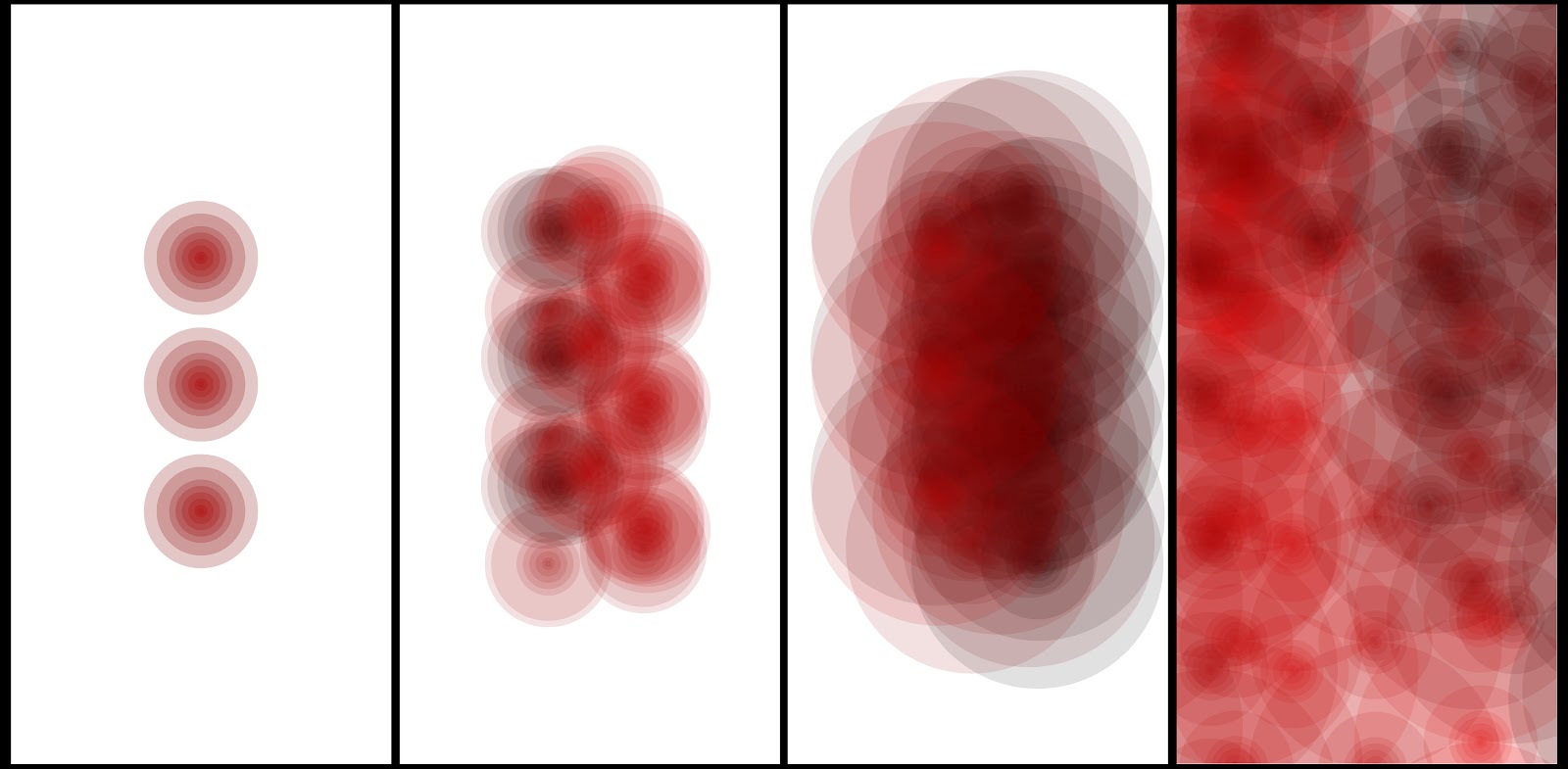
Today Ive been finalizing my code, I changed my design a little to make it more effective, I played with  layers to create a better field of depth, as well as that I wanted to make my design more effective than just circles just layering over each other, this is what I have come up with so far,


Here is the layering I talked about, circles on top of each other to create a depth of field - this will be my first image for my board, you can clearly see the structure and how the noise will be created.

Here we can see how I have changed more than one variable, I have altered the amount of circles as well as the size of the last circle on each shape to create a more effective overall design. I have set the parameters and chosen where the circles lie on the board.

I think I should have an effective design for friday ready for presentations.

Monday, 20 August 2012

I T E R A C T I V E  D E S I G N

Final Design

I N T E R A C T I V E  D E S I G N

Final Project:

Bhai Vareek
Free Intoxication


Ever wanted to get that insanely fun experience which is only caused by the consumption of alcohol but without the painful procedure which is time consuming, body harming and breaks the bank every time, well now you can with my free intoxication glasses! Try the glasses on to experience something unexpected and trick your sense in to believing your vision is impaired. Complete various activates on the activity box to see how you scratch up on relying with only have of your sight sense. Try them on and experience the unexpected yourself. You will be surprised at how much we depend on this sight to complete easy everyday tasks. Enter another dimension today.

Instruction
To use this interaction glasses interface must be applied to your face a worn as normal. Once the glasses have been applied to the face and have been removed from the box, flip the box to revel activates on each of the faces. Complete/attempt activates to revel how your sense react in this situation.
Interaction Instructions:
1.)   Stack the square cut outs and in place in order from smallest to largest, then place on the square outlines on the bottom of the box
2.)   Try to write your name on the note pad
3.)   Take a post it note and try to place in the frame drawn
4.)   Try to compete the eye vision test
5.)   Last instruction is to enjoy the experience!


Friday, 17 August 2012

I N T E R A C T I V E  D E S I G N

Week five Summary:

Tutorial Two:

Final tutorial for this project, I have changed my glasses material as the MDF was to think and hard to work with so i have used think balsa wood which is more effect as it also looks very aesthtcially pleasing. I also fixed my lens problem by having an extra layer of crystal glass to stop the jelly from being touched.

For the rest of the tutorial Cornelia went around and talked to everyone and also went over what to hand in and presentations on monday.

This is what I have so far:


Pro-do type glasses I have produced

New material i will be using for the glasses


Over the weekend I just need to finish my activity box and my exhibition write up and Ill be all ready for hand in on Monday !

S T R U C T U R E  &  N O I S E 

Week Two Summary:

Tutorial Two:

Today we started our own codes and started creating our own patterns:

I was looking at gradients and coloring today to apply to my own code;

this is what I created,


The gradient is effective, 

today I also explored loops as well as creating a code where if i changed one aspect of something another would also alter, like if i changed one parameter another would also change.

So far I have created this form;

Just some circles which I have layered over the top corner with different color gradients to create a feild of depth. 

For next tutorial I want to be finalizing my code for presentations in a week for friday. 

Tuesday, 14 August 2012

S T R U C T U R E  &  N O I S E

Week Two Summary:

Tutorial One:

Today we went through loop tutorials to help us with our pattern for our own projects, there were tasks and then we had to make the code ourselves to create different effects that we could apply to my own design.

here is the outcome of the tasks:


I have learnt some things from this that I will be able to apply to my design to create a effective presentation.

Monday, 13 August 2012

I N T E R A C T I V E  D E S I G N

Week Five Summary:

Tutorial One:

Today I missed class as I fell ill and could not attend, but I kept working on my porject, I have started to construct my glasses from MDF wood, although I came accross a problem with my design, the petroleum jelly was exposed and I will have to think about how I can over come this problem, and also start to think about how I will make the curves that go around the ears.

Other than this I will continue to make my final, and hope to get better soon.

M A K E  & M O D I F I Y 

Final Renders for project one:

81 Models 


Final Model (hero shot - wrapped in ice texture from previous blog post)


Friday, 10 August 2012

I N T E R A C T I V E  D E S I G N

Week Four Summary;

Tutorial Two:

Ive started to make my glasses and my interactive interface. I have chosen to make my final out of wood as I want it to have a nice vintage look and finish to make it look authentic and original. On the activites side of things asked my friend youtube for advice and found this link which I found very interesting and showed me that the effect I want to achieve in fact is achieveable and looks like fun. Here is the link http://www.youtube.com/watch?v=1Tmg0TVo-18 it is a bunch of kids being shown what it is like to feel intoxicated. I have decided for my iteractive box the activites I will have on it will be one where you have to write your name, one where you have to place squares in the outlines of the square, on where you must put a postit in the point drawn and the last activity being a eye test which you attempt to read. From this I think I will able to produce an effective outcome were the person wearing the glasses will experince somthing unexpected.

Today we just worked on our individual work as the tutor talked to us individually asking how we were doing and helping us with developmet.

Here is a drawing I did to show how I am going to construct my glasses and activity box.

I N T E R A C T I V E  D E S I G N

Week Four Summary:

tutorial two:

Today we bought in what we have done so far and presented everything to the class, I bought my prodotype model in which consited of my parents old prescripped glasses with glad wrap and petroleum jelly on te lenses which distorted and obsecured the vision and sight sense and gave a sense of intoxication to the mind.

In class today I experimented with the way I applied the petrolium jelly to the lense, whether I went up and down with my cotton bud or side to side or in a swirl experimenting with what gave the bets effect and most effective effect.

After a lot off applying and cleaning of the lense I came to the conclusion that swirling was the best way to have the jelly applied as when you looked throught the glasses it swirlled your vision which looked most effective.

I have started to think about my physical iteraction as I want to create a box which will have differemt activites on each side to make you realise how your sight is so important and to have fun!


S T R U C T U R E  &  N O I S E

Week One Summary:

Tutorial Two:

Today Ben and Krishna introduced us to loops and we presented our sketches and precedents to the tutors for them to see what we were thinking  of doing and how we are going to present these.

These are my precedents I am going to use for my DSDN142 project two,


I want to use circles as my initial shape for this project as I think it could create effective effects on my final board.

These are my skecthes on how I want my final board to look,


Next tutorial we are going through looping tutorials then start to commence making our own codes for our final presentations.

Thursday, 9 August 2012

M A K E & M O D I F I Y 

Week Four Summary:

Tutorial Two;

Final tutorial for this project, everyone is hectically trying to get everything complete. Today earl went over some more rendering tips with us and then let us get on with our work. I have finely completed my 81 iterations and have my final form. 

As my models were so big i had to create a new file for them so the remaining 36-68 iterations are on this document along with the final, I will merger them all together for the final rendering.


Here is my final iterations a long with my final form, carrying on with the same layout as I would like to use this to present my final render with. You can see that I have been using the taper, twist and bend tool quite a lot as well as the rotate tool to copy forms and create new symmetrical forms. 

F I N A L  F O R M


Here is my final form, after blood sweat and tears, and many long nights! 

Critique:

I think this model effectively looks good aesthetically and provides a sense of each of my words within the model. 

Flake :

I think my model expresses my word flake through the linear form, with the split lines and coulombs as it links to the straight linear lines on my precedent image, not man curves just mainly straight parallel lines to represent flake. 


Oscillating :

My model expresses oscillating movement from top to bottom as the models twist and tapers from skinny to large it creates a sense of a oscillating movement, as when something oscillates it gains momentum and gets larger and larger, which I think I have achieved with the twist and taper modifiers. 


Brittle :

I feel that my model conveys a sense of brittleness through the thin forms and lines which start at the bottom and make its way up to the top using the push and latice modifiers early in the iterations process. 


Over all I think my model has turned out all right and effectively expresses my word, time to render for presentations on Monday! 


For my renders I have decided to use the ice image I had earlier for the texture and the same layout which I think represent oscillation. 


Texture to use

Layout Style