Week Nine Summary:
Tutorial Two:
In todays tutorial we all worked on our photoshop interfaces to desperately get it done so we have a good week or so to work on our files in flash to make them perfect. For my app I had been using an iPhone template to give it an iPhone feel whilst using the application which included tabs, keyboards and fonts but after we received a warm visit from Angela she recommended me to alter the listed before to create a design which is more my own and unique as anyone can just apply those templates to their work and hand it in but when color and layout an aesthetic is considered and you apply your own it is more effective overall and makes it more your own.
As we see above on the left we have the iphone basic color scheme which I had applied originally which looks very generic and boring. Brings a dull effect to the scene as everything is grey which brings no excitement or interest.
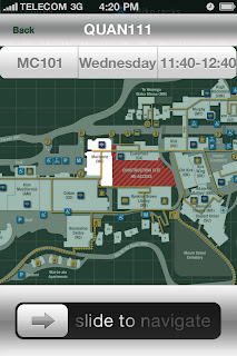
Once I changed the colors to the green applied to the design on the left you can see the screen is brought to life and looks much more effective as well as looking like my own.
I also created my own keyboard style as I was told the original iPhone keyboard is to generic and I need to create something more of my own. I created all of the boxes myself and placed the text inside of them and then added the color scheme which has been used all over the application.
Font wise I did not change the font as after exploration I stuck with the existing font being "Helvetica" as it is easy to read and expresses a good aesthetic feel.
Once I finish cleaning up my photoshop files I will be moving into flash to produce my app :).


No comments:
Post a Comment