Tuesday, 29 May 2012


Group Project 2


Advertisement:


Note - During exporting some error has occurred to cause a glitch in the clip - For original file please email Vareekbhai@hotmail.co.nz

Audio From: http://www.freesound.org/people/VEXST/sounds/40940/

Write Up:
Company: Conflict Records
What we do: Recording and Production
Target Audience: Young, hip, alternative, edgy youths of any economic class who consider music an important part of their identity.
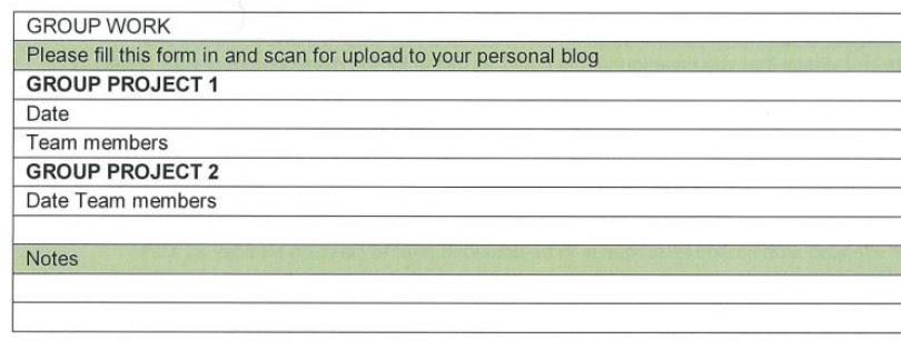

Intentions of the advertisement: Our advertisement is intended to grab the attention of potential artist clients and potential customers of produced music.  It is supposed to make them think that the brand is very cool and that they want to be associated with it, while incorporating the logo and concept (violent conflict, anti-silence propaganda, and musical iconography).  We really wanted a segment with wow factor to make an impression and imprint the brand in the viewers mind so included a portion of strobe color effect.  This hopefully would help the advertisement go viral. We believe we successfully executed our concept to accomplish our intentions.


Group Project2:
Date: 5/28/12
10:30 am Stream
Team Members: Vareek Bhai, David Kirschberg, Natalia Vasquez


Monday, 28 May 2012

L I G H T 


Final Images for the series:


I am happy with my final outcome and I think it works effectively as I showed the travel of light through the essence of un composed images with multiple cars and then composted structured images with a singular car which I composed. 
L I G H T


Third Shoot:


In this shoot I achieved some nicer photos as the quality is better and better composed. From this shoot i gained my final images which will be presented in a different blog post, but i am happy with the out come and it links to the brief. 


L I G H T 


Second shoot:


Tried to play around with an individual car playing with light and the way that the camera captured this light. From this I learned that street lights create a hello image and will need enhancing and photoshopping to achieve an effective image. Light looks effective with the light trails and I like the essence of the light flowing without control and being unable to see the car it self.


I need to develop my skill to active images to a higher quality. I intend to take a final/third shoot and hopefully take some effective images for my series.


Friday, 25 May 2012

L I G H T 


HDR Image produced on photoshop combined with 5 images


 Original Image
HDR Image 

Tuesday, 22 May 2012

L I G H T


Further research into precedents for the light project. 


Tokihiro Sato:


Tokihiro Sato's lighting effects is what brought me to his work, after viewing his portfolios it was easy to see that lighting effects created through the effective use of the camera is Sato's forte. I liked his photos as i could relate to them as i enjoy playing with lighting effects especially light trails left behind from moving objects such as cars.


 In Tokihiro Sato project "Breathing Shadows" straight away we can see the story he is creating, displaying to us the life of light which is always present, the black and white effect of the image is extremely effective as the white glow stands out against the black due to heirachy within the image which draws our eyes more to the light, effects are created through the shutter speed and the use of many light trails, i would like to experiment with this effect through my project but not to the same extent and i also find the narration in this projectt very effective with the "Breathing Shadows".

Reference:http://www.photoarts.com/gallery/SATO/satoexh.html

Sunday, 20 May 2012

L I G H T

Continuing from my initial idea I played around taking some photos last night to generate some more images and to think about how i will execute my series at the end of this project. 


 Playing around with the light drawing, I think the ISO was to high or the exposure as the green light ended up illumination the whole room.
 In this photo i didn't like how you could see the car in the left before it has take off, looks to constructed, and the exposure is to high which caused the image to become very yellow, looks like i have a filter over the lens.
I think this image is very successful as i have achieved the effect that i was after, All we see is the trails around the path creating abstract forms which is in my initial idea to show what i want through this light series. 


I will take some more photos after this to add to my second shoot to create a series. 
T H E  C L I P


My first attempt at making a 5 second stop motion clip, found it very difficult on iMovie as it wasn't very easy to use and i couldn't figure out how to change the transition slides between each image. Overall its all right but i feel if i had more images the clip could have been more effective. I am going to try to use Adobe after effects or premiere next times for those more advanced settings.


Wednesday, 16 May 2012

T H E  C L I  P 


Inspiration and precedents from you tube and from research on the internet:


I liked the way this clip was constructed with the intent to make it look real and it resulted in an extremely effective clip
From the music to the presentation of this clip is very effective as it flows well, many hours was put into this video to produce the final product

For this video I like how the video was presented outdoors and not in a studio or single room, effective final product. 


Initial idea at the moment is to have a sketch which turns from "nothing to something", will express this idea more though the story boarding and next blog post. 

T H E  C L I P 


Mind Map created on word to develop further on the group brainstorm and start to generate some ideas for my own clip. 


Tuesday, 15 May 2012

T H E  C L I P


Ruff brainstorm about what we perceive "Industrial Design" to be, as a group we decided upon industrial design being the "process from nothing to something" effectively and also "Solving a problem in the best possible way. Also on the a3 brain storm is quotes and a drawing which we found effective and which linked to industrial design. 


After this I will construct a mind map using ideas from this group brainstorm and also contributing with my own ideas. 
L I G H T


Precedent:


This precedent is my friend who is studying in a diploma of photo graphics at Massy University. I found his recent series interesting because it contained aesthetics which i would like present in my series such as the light trails form traveling vehicles and playing with the trails to discover the essence of light and the nature. 


 I particularly liked this photograph because the trails of light created from the tail lights from the cars, this is the aesthetic i would like present in my series to explore that nature of light, to show that travel and freedom. A shutter speed of 20seconds was used, this could be easily achievable.
 This photo is also effective, a very steady placing of the camera would be necessary but i like the essence of the light coming through like we are traveling at light speed and you can also so the hand move up and down to change the gear which is effective.
 This photo is one of my favorite. The composition of the image is extremely effective and the light provided form the city light pollution effective provides a nice back lit as the trail of light from the car travels around the corner. Even the light on the tarmac is effect. Very thought out composition and it works extremely well.


Reference: Chinmay Patel, http://www.photomassive.net/2012/04/personal-into-the-night/


L I G H T

First shoot, tried to achieve effective lighting techniques through shutter speed and exposure. Tried to achieve trails of light to create the nature of light and essence of movement. Through these techniques I will be able to produce my series with more thought with my proposal and development

After this I would like to have more cars and more constructed images to produce an effective series


Monday, 14 May 2012

L I G H T

Weekly exercise - Light Drawing

Tried to write my name experimenting with the light,


L I G H T

Proposal:


In this series I am to produce 4-8 images which explore the nature of light specifically looking athow
it relates to photography, what you can do with it to produce different abstract forms, what happens with its absence in the form of low light photography. I will use specific camera techniques such as shutter speed and aperture to achieve this through my series. 

Idea:

As I have a passion for cars and it is a hobby i wanted to incorporate aspects from their physical features to help produce my 4-8 images. I felt that with low light I could create abstract forms of light produced by the cars through their headlights and tail lights to explore that essence of light and nature which links to the brief. Light produced by vehicles and moving objects has always inspirited me because it has direction and a sense of being. For this idea I would ask some of my friends/car enthusiasts and ask them to line up or make a formation to drive to create streams of light through the shutter speed effect to create light trails. I would try to take photos natural and more composed to have a wide series well throughout. 
I would after changes some effects on photoshop to explore the light in more depth and create my final series. 
T I M E

Final Prestation


Friday, 11 May 2012

F L U I D  F O R M 


C U R A T O R I A L 

“People think that design is styling. Design is not style. It’s not about giving shape to the shell and not giving a damn about the guts. Good design is a renaissance attitude that combines technology, cognitive science, human need, and beauty to produce something that the world didn’t know it was missing”( Paola Antonelli(2005)

Both Norman Foster and Jørn Utzon have created forms, which were both missing in the world before their beautiful minds generated their buildings, which combined technology, cognitive science, human needs a beauty. Utzons Sydney Opera House screams fluidity and curvature from one side of the design to the other, in a sense it links to French Rococo as it has wave like form which links to how the designs from the 1800 loved aquatics. Rococo style can be identified as  “Free-form curves (including S- and C-curves), shell forms, asymmetry, natural forms, exotic motifs and scroll work” (Jeannie Ireland (2009, pg 314) which are all present in Utzons design. Fosters design is more simplistic as it consists of numerous straight lines creating a motif of diamonds running up the design.

Both of these designs brought this art inspiration when constructing the model. A shell form conforming each other creates the basis of the model as a straight wire creating a stand and contrasting the fluidity with linear design to create a design with more cognitive science holds it together. The intial shell idea was differentiated from Utzon design. The aesthetics of hierarchy heavily influenced the design as the way the shell gradually reduces in size. Fosters function is shown in the design as the wire forms a base for my model, which provides strength. The main influence of the model design is beauty.

Refrences:

Jeannie Ireland. (2009). History of Interior Design. New York: Fairchild Books, Inc.
Retrieved from Te Waharoa Victoria University of Wellington Library

Paola Antonelli (2005), 80+ Inspiring Quotes about Design
Retrieved from http://designwashere.com/80-inspiring-quotes-about-design/


Wednesday, 9 May 2012


CONFLICT RECORDS

Group Names:  Natalia Vasquez, David Kirschberg, Vaneek Bhai

Assignment: Conflict Records - Music company. 

What Conflict Records Does:  It is a music recording and production company.

Target Demographic:  Young (15-30), edgy female and male individuals who consider music an important part of their identity.  All economic class levels. 

Slogan: The War on Silence

Description:  Our team decided on a design that plays off the war theme related to conflict with references to music by featuring a pair of headphones around an atomic bomb shell. Our logo features barbed wire font with a military gear.


All images produces on Adobe Illustrator solely using the pen tool 

Monday, 7 May 2012

T I M E

Contact sheet for final images:


Selected images were used for final presentation
T I M E


Final Idea


After much thought and development I have finalized my idea for this time project. After intense research on Aristotle and his theory of time I decided to carry on down that path but take a different approach on how I would photograph this theory and express it. To go over the idea again I have copied and pasted the interoperation on Aristotle's theory from my last post,


What Aristotle is expressing in this theory is that the "before" is the past and we know very little about the "after" also known as the future and the present which is now is the same though in respect as our before and after due to the measure of time that occurs now which creates the before and after


What I propose to do to express my idea is to take images of everyday people in wellington which creates an interest for me, but to link this to my idea I am going to take a image of the person without them having any knowledge and right down the time and what I feel as if they are doing at the time and moment I capture the initial photo I will then after a set amount of time go back to the place they were and ask them if i can take a photo of them and ask them what they are doing in the present and ask them what they perceive themselves doing in the near future and then again after the same set time as the start I will come back and take a final image to see if what they said about what they would be doing in the future is true or what they said was right.


From this I establish what the subject is doing "before" in the "now" and the "after" and to see whether the measure of time really creates the now moment which is shown though what the subject says about the "after" and wether they are doing what they predicted. 


I will be doing time period interval of (between before - present and present and after):


- 5minutes
- 10minutes
- 15minutes
- 30minutes
- 30minutes


I hope after this I create an effective portfolio to express my ideas on TIME

T I M E 

Precedents and Inspirations

Bruce Gilden


 I want to have this kind of essence through my portfolio to show truly express emotions 

The expressions in this photograph is truly amazing, as you can see his reacting to Gilden taking his image 


Gilden truly inspires me with his photography. His method truly amazes me how he can so easily take photos of people and subjects in present time without asking them and just does as he feels. From this photography Gilden is able to capture somethings which would never be able to be shown through normal photography. He inspires me with work as I want to portray this style through my first images I will take of my subjects when they do not know that I am taking their images to show expressions that are 
not able to be captured.


http://www.magnumphotos.com/C.aspx?VP3=ViewBox&ALID=2K7O3R148X5I&IT=ThumbImage01_VForm&CT=Album


Robert Frank 


I feel Franks work is some what lined to Guilden's photography but they seem more composed and un natural but the same essence in the work is present and the black and white come through strong. I want the same themes present through my portfolio to present a similar theme but also link and tie back to the essence of time.


Henri Cartier


http://www.magnumphotos.com/C.aspx?VP=XSpecific_MAG.PhotographerDetail_VPage&l1=0&pid=2K7O3R14T1LX&nm=Henri%20Cartier%2DBresson

I feel that all three of these precedents work link together to really show that essence of time, but only in that "now" form. To create my more elaborate project to show "before, "after" and "now" I will have to combine techniques from all of these artist models such as taking photos without people knowing and more constructed images to create an effective portfolio. 


Hopefully from this inspiration I can incorporate this technique and style into my photographs for a effective final portfolio.  

Sunday, 6 May 2012

F I N A L  F I L M

After many hours on flash the final animation has been created. Sounded added from http://soundbible.com/ to add personality and create a fully effective animation film.

F L A S H  D E V E L O P M E N T

After working on flash I produced a initial animation to get critique from my tutor and peers


Self Critique - I think that the tween of the letters is ineffective inside the bomb and needs development as well as the explosion scene where the bomb explodes, very basic and does not perform to meet criteria.

Critique from tutor - The explosion needs re working as well as not blowing up at the start (increasing the bomb at the start) as it is on the fence between bomb and something just expanding. Also work on in to make it more personal and add personality not just the normal bomb blowing up. Adding sound will also improve work


As we can see here i have altered the bomb explosion scene so it is only letters which are used to express the bomb exploding, letters are cent everywhere opposed to the original tween which is shown on the right. Overall the scene is now more realistic and expresses my point more effectively. 

In this scene the bomb does not expand anymore but zooms onto the wick to emphasis the burring of that opposed to trying to make the bomb expand which was ineffective. Also the tween for the letter have been altered so it comes across more clean opposed to being messy and change forms ineffectively.


Adding some final touches I added a bit of personality with moving letters at the bottom of the stage to act like panicking people screaming to add some humor and personality to overall create a truly effective animation.