Friday, 30 March 2012


R E S E A R C H  S T A T E M E N T  &  A N N O T A T E D  B I B L I O G R A P H Y 


Neoclassicism and neoclassical Architecture 

Neoclassical architecture has always inspired me and I have always found this style of design interesting. I have chosen neoclassicism as my research topic as I wanted to explore the architectural designs in Athens in more depth to have a better understanding of it. I have used different sources to obtain a wide range of knowledge on the topic and I aim to have an exceptional grasp on neoclassicism at the conclusion of my research. 


Website: 
Alex Galuzin. (November 14, 2008). NeoClassical Architecture. Retrieved from
http://www.worldofleveldesign.com/categories/architecture/neoclassical/neoclassical_architecture.php

From this source I obtained a good knowledge about the aesthetics and physical form of the architectural structures from Athens in the neoclassical era. Initially the coulombs were used to hold the weight of the structure but later on became a visual element of the neoclassical design. The defining characteristics used to identify a neoclassical building consist of: Clean, elegant lines, uncluttered appearance, free standing columns, massive buildings. Purity was considered whilst designing in this era as the architecture design was linked to temples to show their most purest forms.  
Image:
The Parthenon [image]. (1942). Retrieved from
http://www.goddess-athena.org/Museum/Temples/Parthenon/


The Image used is of the famous parthenon structure in Greece and from this image I can see the aesthetics applied which I learnt from the website source. I can straight away see the temple like features reinforced with the white marble material used to emphasis the purity feel. Tall coulombs that hold up the structure creates a entrance and the from of the building. Overall from this image I can see all the aesthetics from the neoclassical era from 1850-1900
Book: 
Damie Stillman. (1988). English Neo-classical Architecture. London: Zwemmer Ltd. Retrieved from Te Waharoa Victoria University of Wellington Library
This book was more effective than the other sources as this book looks at the origin of neoclassical architecture opposed to the form itself. With 400 photographs and detailed investigations, a good understanding to the origin can be obtained. Damie specifically looks at 1755-65 in Rome before the distinctive neoclassical characteristics were present.  
Journal: 
L. Balslev Jørgensen & Demetri Porphyrios. (1987). Neoclassical Architecture in Copenhagen Athens. vol 57 no 3/4. 5-15. Retrieved from Te Waharoa Victoria University of Wellington Library 
This journal looks more into depth about the details on the neoclassicism architecture such as material and reasoning opposed to the other sources which concentrate on the physical aspects of the architecture. The journal also expressed aspects of the post neoclassical and post neoclassical architecture which helped me to gain a wide perspective on the subject. 
Edited book:
Middleton, R. Wathin, D. Alison. E. C (ed)(1980). Neoclassical 19th Century Architecture: Harry. N. Abrams, incorporated. Retrieved from Te Waharoa Victoria University of Wellington Library
This book was effective as it focused on the beauty of the architecture opposed to my other sources that solely look at the aesthetics and function of the buildings. Its said that when they were building their designs, "beauty" was always present in the back of their minds and it is said that the materials they used were not used just because of the share fact of being effective and provide good function but it always emphasizes the beauty with the white clean marble and the curves created by it, it shows a different perspective to the Neoclassicism era 

Over all, all the source provide relevant information and studying them would give me a large array of information about neoclassical architecture. 

Wednesday, 28 March 2012

I N D I V I D U A L  D R A W I N G 


Hand in - Drawn using a precedent as an inspiration using their aesthetics through my drawing, 2 point perspective of my iPhone 

Frank Lloyd Wright

I chose Frank Llyod Wright as my pretend for my individual drawing as his work has always inspired me. His architectural drawings always stood out to me and a consistant drawing style that Frank would use was the two point perspective. Two point perspective drawings are effective as it create a three dimension image opposed to regular two dimensional drawing techniques which only shows one face and one view where as in the two point you can show three sides and numerous faces in the drawing. As you can see in the precedent image i followed the images shows many sides and faces and is just an effective image overall. I have used my iPhone for my drawing but have made it abstract by cutting it into pieces and applying ink. I intentionally drew it free hand as i though it gave it a more natural and unique finish, close to Frank Llyod Wrights. His work is an inspiration to me. 


Precedent Image


Reference  http://penandink.homestead.com/files/Prairie.JPG


T O U C H  A N D  D R A W


Hand in - An abstract image created form an everyday object that i associate it, it has been abstracted though blowing it up and focusing on the geometric forms of the object. 

A B S T R A C T  S E C T I O N


Hand in - Abstract drawing created using cut out and blowing up form a once one piece form. finished with hatching to show the different materials used in the object 

O R T H O G R A P H I C 

Hand in - Orthographic drawing of an everyday item in my bag, my item was my iPhone consisting of the plan view and front, back, side, top and bottom elevations. 
H A T C H 

Hand in - Hatch. 24 squares consisting of different patterns hatched within each square using black ink to create a gradient from the right bottom corner to the left. 

I D E N T I T Y 


Hand in - Identity, five items out of my bag consisting of my iPhone, debit card, craft knife, ruler and headphones then applied black ink to creat positive and negative space.  

Monday, 26 March 2012

S P A C E

Final images :)


S P A C E

Mini world, Had some trouble with photoshop, will update the cropped image asap


Wednesday, 21 March 2012

C O P Y and T R A N S F O R M

Drawing Style Research

De Stijl:


- "De stijl" is Dutch for "the style" which in 1917 it was also known as Neoplasticism, ideas were expressed by derived form and color and expressed in a composition with vertical and horizontal lines only using primary colors as well as black and white.


In these images we can see the De Stijl style coming through the composition with the many vertical and horizontal lines crossing over each other creating a plane of squares and rectangles which create a sense of repetition around the piece as the squares are repeated across the composition as well as a form of hierarchy as the shapes and sizes of the squares are different. In the bottom image in particular movement is created as as our eyes travel from the bottom left of the composition to the top right due to the movement created by hierarchy and the primary colors blue, red and yellow. In my opinion i find this art era very effective as the line work stands out to me and the design principals in the composition all add up to create a truly effective piece of art. 

Art Nouveau:

- A decretive style of art which was most commonly popular between 1890-1910, the name "art nouveau" is french for "new art". Comparted to De stijl this form of art is very symmetrical and curvy as it was inspired by natural forms and structures such as plants and and flowers which shows the essence of the curvy design applied. Some may say that this era was very feminine but it ended as modernism entered in the twentieth  century when the modernism era had started taking over the world but Art nouveau is still present in new designs 


 We can instantly see in both the architecture and the design on the top we straight away are drawn to the curvature occurring through out the composition which touches upon that feminism throughout the era, this style or art has become effective as the asymmetry creates a different effect compared to the normal straight and horizontal planes we are very used to. The art in a way to me looks very modern when it is clean like in the bottom image from a hotel where the florally inspired designs create a modern feel in the room. The curves create a strong sense of movement within the composition and normally are towards or centered away from a focal point. Overall an effect era and with the right designs it is still effective in the present day.

Artist Precedents:

lázsló moholy–nagy:


lázsló moholy–nagy was a  Hungarian painter and photographer (July 20, 1895 – November 24, 1946) and was also a professor at bauhaus school. 


I like lázsló moholy–nagy style of art as it reminds me of the De stijl style with all of the straight lines and planes, although they are not at perfect horizontal or verticals we can see the style coming through with the crossing straight lines on top of each other creating new forms underneath it. Colors are also similar but the primary color through lázsló moholy–nagy art is red and different forms of red like warm yellows and reds. I like the focal points which are created through the crosses made by the linear lines crossing each other. movement is created throughout the composition as the lines do not stop and go through one side of the composition to the other. I find the use of colors effective and overall lázsló moholy–nagy style of composition stands out to me and draws my attention. 


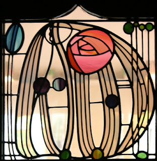
Charles renee macintosh:


Charles Rennie Mackintosh (7 June 1868 – 10 December 1928) was a scottish architect and artist who expressed art nouveau through his art. 


If we look at Charles Rennie Mackintosh work straight away you can see the aspects of art nouvea coming out, the asymmetrical composition along with the curvature along the composition and and unbalanced design. focal points are created through the colors and the curves creat movement which take our eyes around the composition. overall for me i prefer symmetry and straight lines because I'm ocd about those kind of things and prefer the works of  lázsló moholy–nagy but in certain aspects this form of art is still effective and present. 

Tuesday, 20 March 2012

S P A C E

Playing around with black and white (greyscale) modes in photoshop to get a different perspectives on the images and what they are showing 


 I particularly like this image as normally graffiti has many colors and is quite alive but as i have made it black and white the color is take away and brings out a different perspective to the image

S P A C E

Photoshoot two


Contact sheets from photoshoto two at Waitangi Park:


My most effective photos in my opinion were:

I found this photograph effective as I liked the perspective it was shown in and i gives the viewers a feeling that were looking from the perspective of someone else, a skater at the park. We can see the relationship between the person and the space. 

Like the above photo it gives us the sense that were seeing it through the eyes of someone who is actually at the park skating

I found this image interesting as the pole is in the central position and the skate board is balanced on the pole but isn't focused on the board so its shown in the background but isn't a focal point

I found this image very effective as the two graffiti boards on either side create an effective frame in the photograph and contain the space between them and create an effective perspective view 

Lighting effects in this image and the image bellow are effective and with a longer shutter speed and higher aperture i am able to get some effective techniques with the lighint bringing out the light from within the wooden woodenstructure 


Monday, 19 March 2012


DSDN 171 - Design Personae

“A man who works with his hands is a laborer; a man who works with his hands and his brain is a craftsman; but a man who works with his hands and his brain and his heart is an artist." - Louis Nizer, this quote is from famous lawyer Louis Nizer inspires me as I, Vareek Bhai, believe that during my time studying at Victoria University, I will constantly be shaping myself into an artist. From a young age I have been quite handy with a pencil in my hand and a colorful imagination, drawing all day and night. Perfecting my stick figure people and box houses, I slowly gained a passion for drawing and design. Graphics and Design at High School were always my favorite subjects as they caused my passion to grow stronger. They were always my strongest subjects and I felt that through Design I could express my feelings on editing programs such as AdobePhotoshop and in Graphics I could draw whatever my heart felt. This led me to Victoria University to study a Bachelor of Design Innovation with a Major in Industrial Design as after University, I see myself designing products for consumers to enjoy. I chose Design as I have a passion for it and I love being hands on while still having the opportunity to expressing myself.
I have always found Steve Jobs as an inspiration and looked up to him. Till date, he has improved and designed the most recent and new way for communication and living life, through all of his products. Owning and operating the iPhone and Macbook myself helps me relate to this and, I too hope one day I can provide solutions to people similarly to what Steven Jobs has and to achieve all my goals whilst attending Victoria University, and to make my family proud.

Wednesday, 14 March 2012

S P A C E


Artist Precedents

Levi Brown:

Levi Brown's contemporary play on everyday things shown as intriguing images showing her thinking and story drew my attention as soon as I saw on of her images. Bright flu recent colors create focal points and cause us to give more interest into her images. Compositions are very bright with color and repetition creates movement across the image. Over all I found her work very interesting and fascinating.


 I like this image taken by Brown as the colors stand out to me straight away and draws my attention, the image consist of lots of crayons layer to create depth within the image and create an essence of three dimensions within a two dimensional image. Overall I find the image effective and find the depth created very effective

Like the image above both of these photographs also have vibrant colors throughout the compositions which goes with her theme and the design principals he follows. I like the image on the left as the perspective is very interesting as it is taken from behind another plane to show the bottom of the boots with water drops which also makes the frame more interesting, I like Levi's style and the way colors are bought out, I may portray this through my work to show more vibrant colors.

Reference: http://www.levibrownphoto.com/

Sian Bonnell:

Sian's photographs are extremely abstract and she brings real and unreal things together bring a fantasy like feel to the photographs, she has many projects which all consist of abstract ideas which overall work effectively to create an interesting story for the viewers.

In this project from which this image was taken from Sian is creating an narrative for how "When the domestic meets the wild" which is very abstract especially with the iron which is orange which stands out as a focal point due to the hierarchy within the photograph and it looks abstract due to the fact that a beautiful peaceful garden scenery is disturbed by the 1950 iron which for some may not be effect but in my perspective i like the abstractness of this photographic and it works well.

This image is from Sian's project named the "glowing" which straight away we can see the effect of this in the image where we see a abnormally shaped object in the grass field which is glowing illuminating its surroundings, she has used an appropriate shutter speed and aperture to get the glowing effect from this image which is some of the techniques i would like to apply to my personal project to display different effects from lighting in my photographs

The perspective of this image is what bought my attention when I first glanced at this image, I think that it is very effective how Sian has made the strainer in the background look so large in the image almost giant like but then from the prospective the image has been take we see the grass and think it can't be any larger than a normal strainer but our minds play tricks, i think it could be effective if i could apply this perspective or point of view style into my photographs to show a better narrative feel or point of view.

Reference: http://www.sianbonnell.com/


Tokihiro Sato:


Tokihiro Sato's lighting effects is what brought me to his work, after viewing his portfolios it was easy to see that lighting effects created through the effective use of the camera is Sato's forte. I liked his photos as i could relate to them as i enjoy playing with lighting effects especially light trails left behind from moving objects such as cars.


 In Tokihiro Sato project "Breathing Shadows" straight away we can see the story he is creating, displaying to us the life of light which is always present, the black and white effect of the image is extremely effective as the white glow stands out against the black due to heirachy within the image which draws our eyes more to the light, effects are created through the shutter speed and the use of many light trails, i would like to experiment with this effect through my project but not to the same extent and i also find the narration in this projectt very effective with the "Breathing Shadows".

Reference:http://www.photoarts.com/gallery/SATO/satoexh.html

Tuesday, 13 March 2012

S P A C E 


Photoshoot One 


My first photoshoot on contact sheet at locations bus stop, bus depo and Waitangi park


Three photos which I felt were my strongest:

I found this strong image strong as the frame is well constructed within the image and focus on the buses which are behind the door and the one door closed emphasis how the busses are contained behind the doors were they are maintained and serviced which is something people don't think about.

The lighting in this image is effective and the use of shutter speed aperture I have added some effective effects and it brings out the graffiti on the wall, one negative about this image is that I think Ive focused to much on the graffiti itself but the perspective from below is effective to show our perspective from the eye of a child or skater using the facilites.
The straight lines shown through the perspective provides an effective frame around the composition, the cones is a strong focal point which was set up by the skaters themselves and the light behind the graffiti wall is effective coming from behind it to provide effective illumination and shutter speed makes the lighting look effective and work well.